Impact of Color Selections in Healthcare Environments
A carefully selected color palette is a critical component of a successful healing environment. Evidence-based research in medical design has indicated that color selection can reduce medical errors, improve patient outcomes, and contribute to increased staff productivity and morale. Color can be an impactful as well as an aesthetic design element.
However, due to the psychological and physiological responses to colors, it is important to consider the potential impact color choices may have on the clinicians, patients, and patients who will use the space. Below are key considerations when selecting color palettes in healthcare spaces:
Impact of Color on Elderly Patients
Studies have clearly indicated that color vision deteriorates with age. The lenses of the cornea begin to yellow and the cells in the retina responsible for normal color vision decline in sensitivity, causing colors to become less bright and the contrast between different colors to be less noticeable because muscles controlling pupil size and reaction to light begin to deteriorate, causing the pupil to become smaller and less responsive to changes in ambient lighting. As a result, people in their 60s often require three times more ambient light for comfortable reading than those in their 20s.
Green is a calming color and connotes nature, and blues soothe and instill confidence. Both are excellent choices for geriatric or long term care patient rooms because they create a sense of tranquility. However, more vibrant colors can be used where appropriate. For example, patients with Alzheimer’s or dementia often forget to eat. Pops of color in the dining areas of a memory care facility can help these patients associate color with eating.
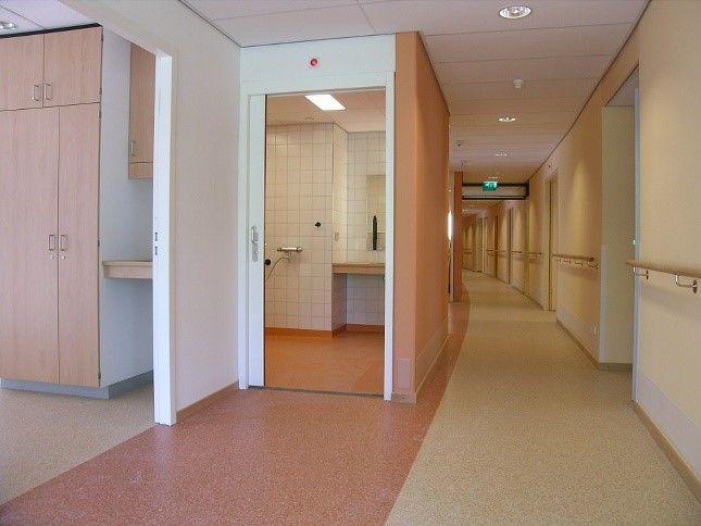
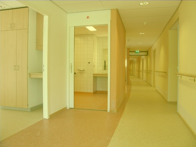
Source: ‘Designing Lighting for People with Dementia’ by Pollock, R., D. McNair, B. McGuire and C. Cunningham, 2008
Green is a calming color and connotes nature, and blues soothe and instill confidence. Both are excellent choices for geriatric or long term care patient rooms because they create a sense of tranquility. However, more vibrant colors can be used where appropriate. For example, patients with Alzheimer’s or dementia often forget to eat. Pops of color in the dining areas of a memory care facility can help these patients associate color with eating.
Pediatric Environments
Children are very fond of color and often use color as a way to express their feelings and thoughts. As a result, pediatric facilities often feature colorful palettes to reduce anxiety and stress for young patients. Be judicious in the use of primary colors in these spaces and consider using strong primary colors as accent walls because the brightness and saturation of the color can overstimulate young patients.
Warm colors like orange, yellow, pink, or red can be used as an accent color in entrance and waiting areas to welcome the children. Consider light blue or green for corridors, as well as for consultation and treatment rooms because those colors have a relaxing and calming effect. Bright colors and playful patterns reflecting animals or nature can be applied to the public zone within the patients’ area. Just as with dementia patients, introducing color in pediatric patient rooms can stimulate the appetite of the children.
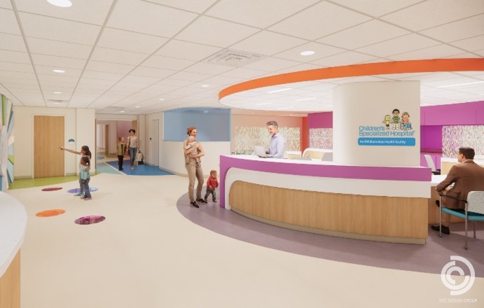
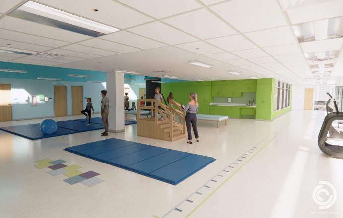
Renderings of new Outpatient Facility for RWJ Children’s Specialized Hospital in Union, NJ designed by Posen Architects and DCC Design Group.
Color Choices for Children on the Autism Spectrum
According to a joint report from Johns Hopkins and the CDC released in 2020, the prevalence rate for Autism Spectrum Disorder (ASD) has nearly tripled since 2000, from 0.67 to 1.85 percent. Research indicates neural deficiencies and/or chemical imbalances can contribute to changes in how Autistic children perceive color, citing that almost 85% of children with ASD see colors with greater intensity than non-autistic children. Remember to not only consider color but shade intensity when designing spaces for ASD-diagnosed patient areas.
Neutrals and muted colors reduce visual stimulation and can quiet the mind and create calm. Avoid bright whites and any colors that a child might correlate with an unpleasant medical experience. Often designers use primary colors including red, blue, and yellow in pediatric physician offices. Consider saturation and the intensity of colors selected. Red and yellow are not good choices as children with ASD perceive these colors as fluorescent. Muted greens, blues, pinks, soft oranges, and neutrals can be very comforting. Be mindful that often children diagnosed with ASD might become visually stimulated by high-contrast patterns and textures and can become fixated on them, so best practice designs do not include patterns and textures.
Behavioral Health Color Options
When selecting colors for behavioral health facilities, the goal is to provide a warm, therapeutic environment that is calming. The environment should be neutral and try to avoid colors that could excite or upset patients. There should not be a single color that dominates or is too strong.
Optimal accent colors for treatment centers include pastel hues of blue and green, taupe, and warm purple or violet. Use accent colors sparingly. Strive to have the color palette flow from room to room to create a sense of flow. If you have a pastel in one room and walk through the doorway to the next room with an accent wall, the transition may be jarring and that could negatively affect the patient.
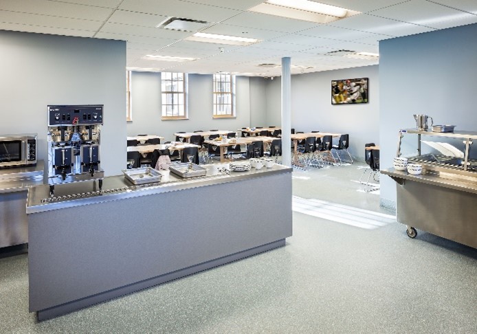

Posen Architects repurposed an historic landmark into Thomas A. Wilson Building, an award-winning Alcohol, and Substance Abuse facility for Camelot Counseling Centers, Inc., that houses 45 males residents.
Darker colors such as grey and black should not be used as they can trigger sadness. Similarly, red should be avoided as well as it is most often associated with blood, trauma, fire, or the police.
Operating Rooms
Surgeons can experience successive contrast afterimages after intensely viewing organs and blood, causing them to see blue or green spots when looking at a white wall or scrub uniform. This is one of the reasons surgeon scrubs are not white. Similarly, using green or the combination blue/green for the walls for operating rooms will help alleviate afterimages. This is because green is on the opposite end of the color spectrum to red, making it a very good choice for ORs.
Corridors and Hallways
Color can be an effective tool in wayfinding in healthcare settings. Hospital corridors can often seem like a maze and easily confuse visitors. Strong color accents at destination points can be a very cost-effective method to enhance wayfinding. These accents can also help identify different program areas.
Color Palette Selection Checklist
Below, find a quick reference checklist to help guide color palette selection for selecting colors in healthcare facilities:
- Consider the age of the people using the area.
- Is the area primarily going to be used by patients, visitors, or clinicians?
- For specialized program areas, research the type of impact the disease will have on the patient in terms of color perception.
- Determine if contrasting or accent colors will be perceived as jarring.
- Is the design goal to create a calm and tranquil area or is the primary goal to stimulate the senses?
- Consider the amount of natural light that will be in the area, as it can intensify color perception.
For more information, here is a link to one of the seminal publications on the use of color in healthcare facilities published by the Center for Health Design.
